

Vue Effort Slider Tutorial: A Vue 3 Slider Component with WebGL-based Flame Trails
What It Is
vue-effort-slider is a highly customizable Vue 3 slider component that features real-time WebGL flame trail effects, inspired by the effort slider from Claude Code. When the slider is dragged to a certain threshold (the default value is 100), the GPU-accelerated flame trail effect is activated. It also includes a smooth “snap to scale” animation, dynamic color customization, and zero runtime dependencies.
In simple terms, it turns a regular 0–100 slider into an AI “thinking depth” selector with a modern, customizable appearance.
Effect Preview
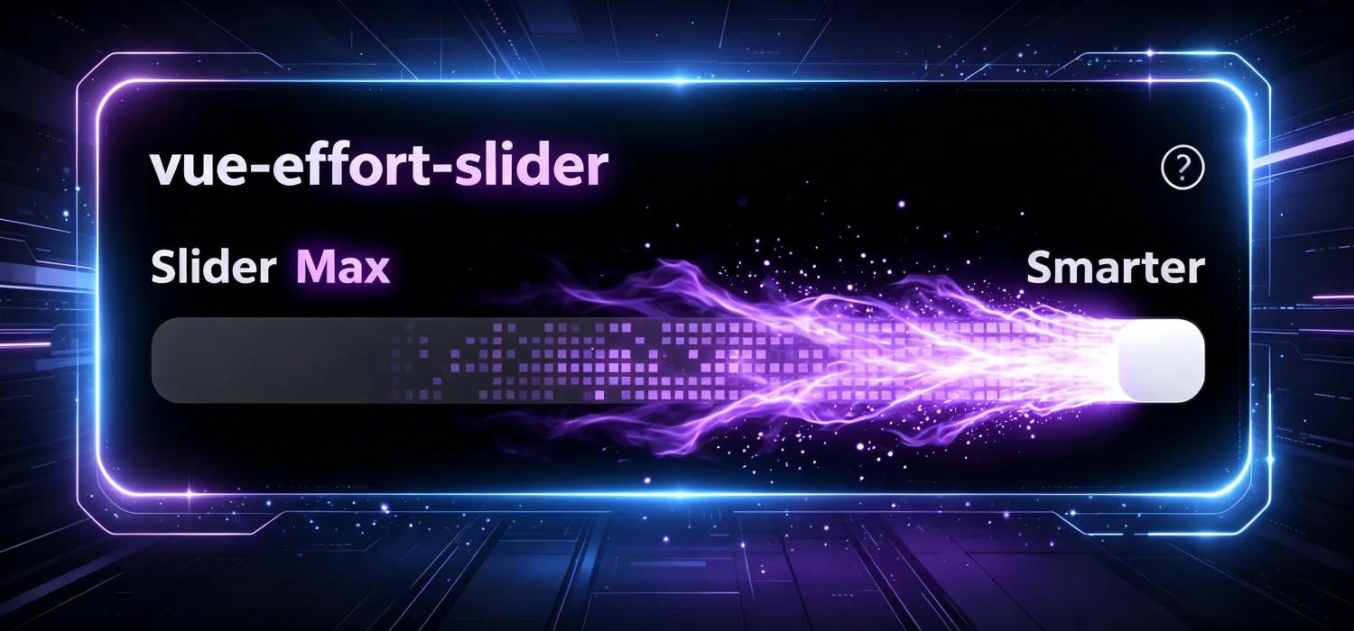
Flame trail effect at the maximum position:

Real-time demonstration of regular dragging (animated image):
Core Features
- WebGL2 Flame Trails: The GPU-driven flame effect is activated when the slider reaches the threshold.
- Snap to Scale Animation: The slider smoothly snaps to the nearest 25% position using a cubic ease-out transition.
- Full Customization: Over 10 color properties allow you to customize every visual element, such as the slider, flame trails, track, labels, and glow.
- v-model Support: Standard Vue two-way binding (
modelValue). - Squircle Cutting: The slider and track use an Apple-style elliptical cutting path.
- Responsiveness: The width can be set as a pixel value or a CSS string (e.g.,
'100%'). - Help Bubble: Built-in help icons and a teleport tooltip.
- Lightweight: It has zero runtime dependencies and only requires Vue 3 as a peerDependency.
Installation
npm install vue-effort-sliderQuick Start
Creating a Project from Scratch
# 1. Create a project
npm create vite@latest my-slider -- --template vue
cd my-slider
npm install vue-effort-slider
Modify src/App.vue:
<script setup>
import { ref } from 'vue'
import { EffortSlider } from 'vue-effort-slider'
import 'vue-effort-slider/style.css'

const value = ref(75)
</script>

<template>
  <EffortSlider v-model="value" />
  <p style="color:#71717a;text-align:center;margin-top:16px">Current value: {{ value }}</p>
</template>
# 2. Run the project
npm run devOpen http://localhost:5173 to view the slider with the flame trail effect.
Global Registration
// main.js
import { createApp } from 'vue'
import App from './App.vue'
import VueEffortSlider from 'vue-effort-slider'
import 'vue-effort-slider/style.css'

const app = createApp(App)
app.use(VueEffortSlider)
app.mount('#app')
Local Import
<template>
  <EffortSlider v-model="value" label="Thinking Depth" />
</template>

<script setup>
import { ref } from 'vue'
import { EffortSlider } from 'vue-effort-slider'
import 'vue-effort-slider/style.css'

const value = ref(50)
</script>
Conditional Import of Modules (Tree Shaking)
// Import the entire component
import { EffortSlider } from 'vue-effort-slider'
import 'vue-effort-slider/style.css'

// Import only the component
import { EffortSlider } from 'vue-effort-slider/EffortSlider'

// Import specific composables
import { useSliderState } from 'vue-effort-slider/useSliderState'
import { useWebglFire } from 'vue-effort-slider/useWebglFire'

// Or import multiple composables at once
import { useSliderState, useWebglFire } from 'vue-effort-slider/composables'

// Import only the shaders
import { VERT, FRAG_SIM, FRAG_BLUR, FRAG_COMP } from 'vue-effort-slider/shaders'
Independent Flame Canvas
You can use useWebglFire to apply the flame trail effect to any canvas:
<template>
  <canvas ref="canvasRef" width="400" height="60"
    style="width:400px;height:60px;border-radius:10px;background:#0c0c0c" />
</template>

<script setup>
import { ref } from 'vue'
import { useWebglFire } from 'vue-effort-slider/useWebglFire'

const canvasRef = ref(null)
const sliderValue = ref(100)
const isActive = ref(true)

useWebglFire(canvasRef, sliderValue, isActive, () => '#a857f7')
Online Configuration Panel
The component comes with an online configuration panel at slider.qiyuan.icu, where you can adjust each property in real-time, preview the flame trail effect, and copy the generated code (animated image) with one click:
To start experimenting with the parameters directly, visit slider.qiyuan.icu.
Properties
Basic Properties
| Property | Type | Default Value | Description |
|---|---|---|---|
modelValue | Number | 75 | Current value; supports v-model (range: 0–100) |
width | String | Number | 376 | Component width (in pixels or as a CSS string, e.g., '100%') |
label | String | 'Slider' | Text on the top label |
threshold | Number | 100 | Threshold for activating the WebGL flame effect; setting it to 100 means the effect is only active at full value |
scaleLabels | String[] | ['Faster', 'Smarter'] | Scale labels for the track ends |
statusLabels | Object | { level1: 'Minimal', level2: 'Low', level3: 'Medium', level4: 'High', level5: 'Max' } | Text for the 5 different levels |
background | String | '#000000' | Background color of the slider card |
borderRadius | String | Number | Corner radius of the slider card (in pixels) | |
showHelp | Boolean | Whether to display help icons | |
helpText | String | ”Drag the slider to adjust AI thinking depth” | Text that appears when you click the help icon |
Color Properties
All color properties accept any valid CSS color value (hex, rgb, hsl, etc.):
| Property | Type | Default Value | Description |
|---|---|---|---|
labelColor | String | '#b0b0c7' | Color of the top label text |
statusColor | String | '#a1a1aa' | Color of the text when the threshold is not reached |
activeColor | String | '#c084fc' | Color of the text when the threshold is reached (with a glow) |
highlightColor | String | '#c084fc' | Glow color of the slider when the threshold is reached |
scaleLabelColor | String | '#b0b0b8' | Color of the endpoint labels |
helpIconColor | String | '#a1a1aa' | Color of the help icon |
trailColor | String | '#a857f7' | Color of the WebGL flame trail |
thumbColor | String | '#ffffff' | Color of the slider handle |
trackColor | String | '#0c0c0c' | Background color of the track |
dotColor | String | '#494950' | Color of the 5 decorative dots on the track |
Events
| Event | Callback Parameters | Description |
|---|---|---|
update:modelValue | Number | Continuously triggered during dragging, used for updating the v-model |
change | Number | Triggered once after the dragging ends and the snapping animation is complete; the parameter is the final value |
help | “ | Triggered when the help icon is clicked |